UI assets
When designing UI assets of our products for marketing purposes, we follow a specific set of rules and principles.
General purpose assets
When creating marketing assets for use in social media on websites and for animation in video ads, the goal is to reduce the amount of text used and simplifying content fields to the point where only the general purpose of the asset’s functionality is highlighted. This reduces the strain on the user and simplifies the overall perception of our communications.
Muted colours are preferable in these designs. If the product features bright colours, they can be modified for this use case.

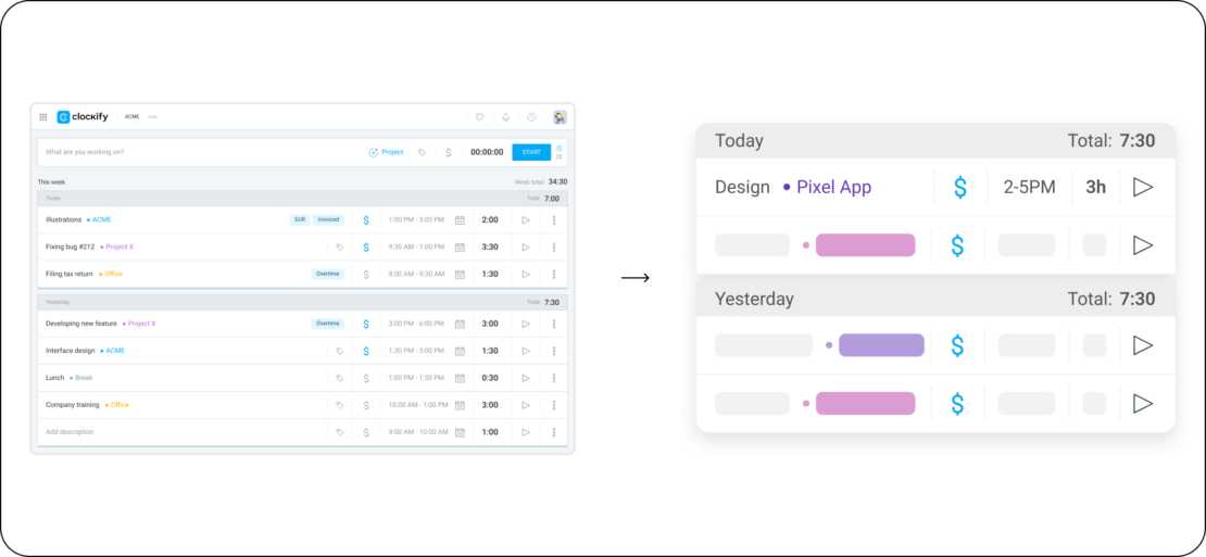
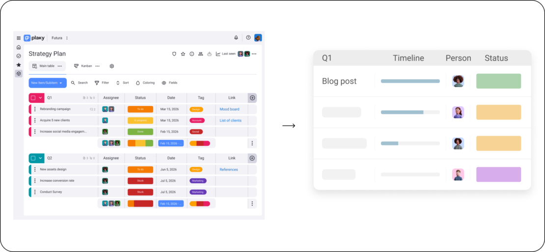
Simplified assets
This is an even more simplified version of the general purpose assets, mostly used on websites and in onboarding parts of product UI to only highlight the most essential functionality.
In these cases, fading gradients can be used for the lower part of the asset. These designs are always combined with a heading or explanatory text and most not be used without it.


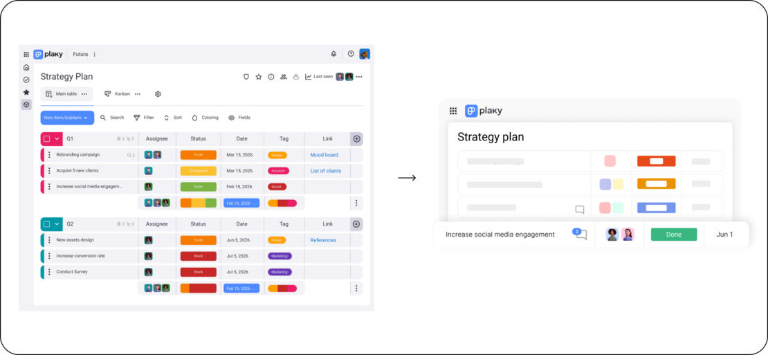
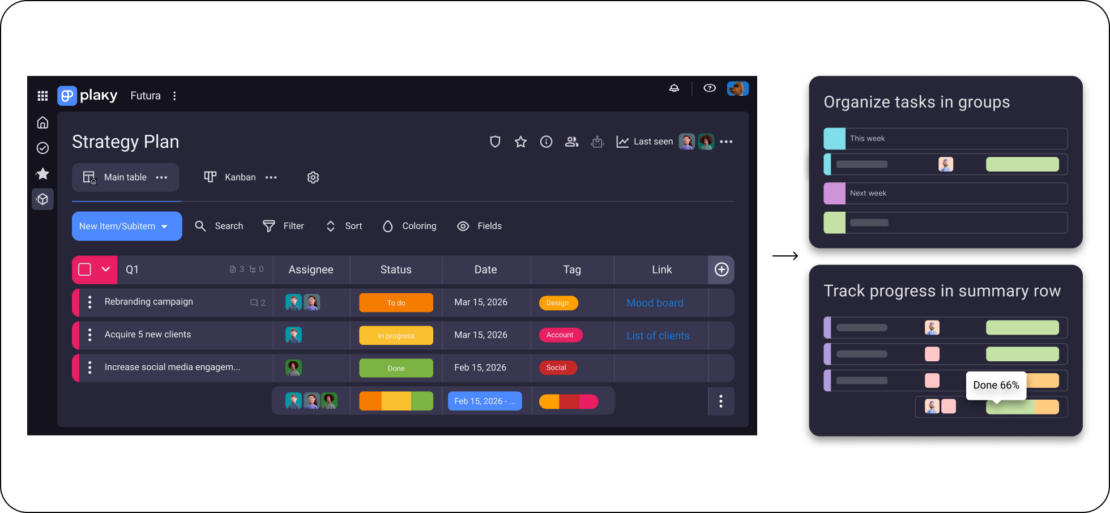
Minimalistic assets
This approach is used to deliver content in an even more simplified way, distilled to its very essence. Their main application is for paid ads, although sometimes they can be used on websites as an edge case. The purpose of these assets is to be as little of a distraction as possible, maintaining focus on the message. These assets must never be used without an accompanying text.


Copywriting and content
Most of our pre-defined assets already have approved copywriting and other content. However, when creating new assets, several rules need to be followed:
– User names must be realistic
– Task names, messages and other text must be relevant to the use case, no lorem ipsum allowed
– Dates must be relevant in accordance to current real world months/years
– User avatars must all be from our illustration library only