Typeface application
Title typography sharpening
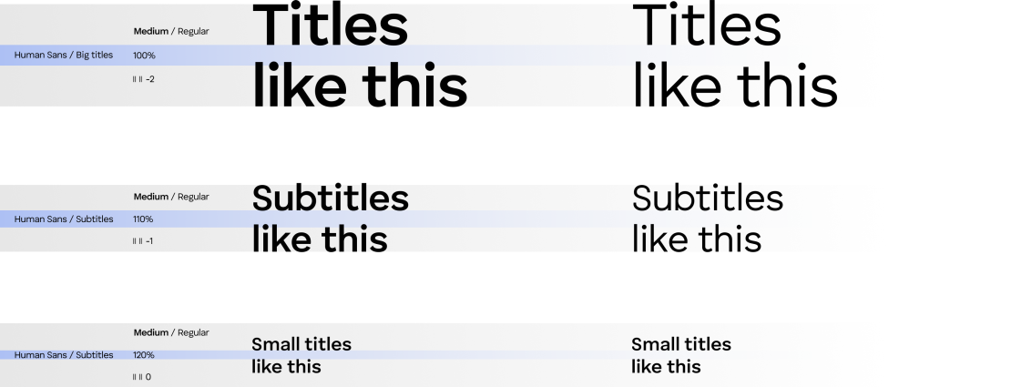
Optimize titles for visual balance by adjusting line height (100-120%). Use tighter spacing (90%) for large headlines and looser (up to 120%) for multi-line titles. Apply subtle negative letter spacing (-2 to 0) for sharpness, especially with uppercase or larger fonts.
Body typography sharpening
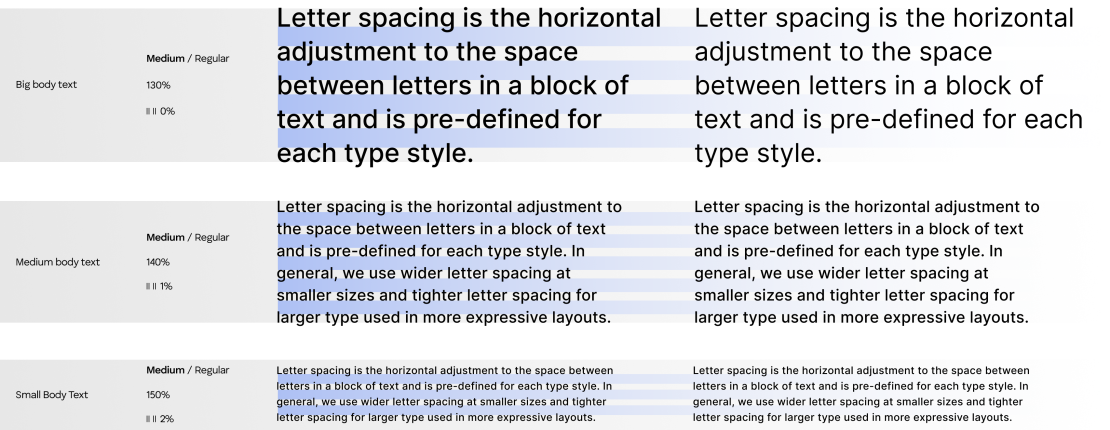
Body text should be easy to read, with a line height between 130% and 150% to support clarity in longer passages. More space between lines improves legibility, especially in dense text. Letter spacing should stay between 0 and 2 to keep the text clean and open.
Hierarchy
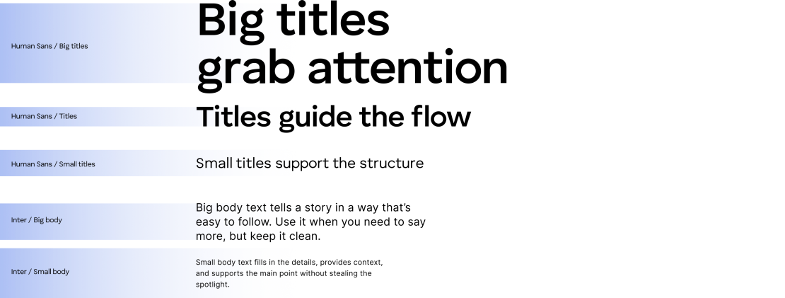
We use Human Sans for all titles because it is bold and clear, making messages stand out. Inter is used for body text because of its easy readability at any size.
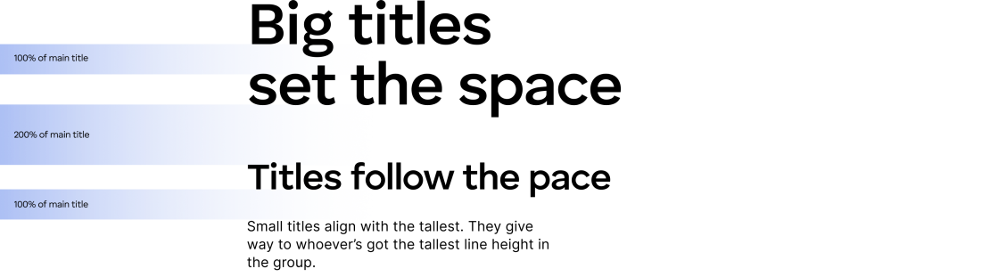
Titles line height
The minimum spacing between titles and body text is defined by the line height of the largest element in the group, whether it’s a title or a body paragraph. This ensures enough breathing room in the layout and maintains visual clarity across the hierarchy.
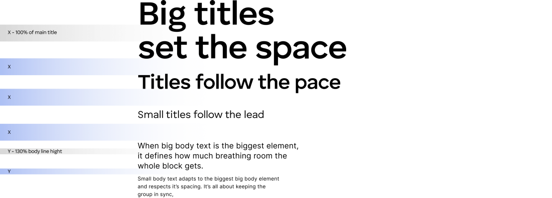
While this is the recommended approach, using slightly smaller spacing is allowed when the layout requires it. Flexibility is key, as long as clarity is preserved.
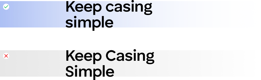
Casing
In our system, titles and body text use sentence case, so only the first word is capitalized. Avoid title case (Capitalizing Every Word) because it breaks our brand’s tone and look.
Pairing
The key rule to pairing primary and secondary typeface is that the title font should always be as heavy or heavier than the body font, never lighter.

Letter spacing is the horizontal adjustment to the space between letters in a block of text and is pre-defined for each type style.

Letter spacing is the horizontal adjustment to the space between letters in a block of text and is pre-defined for each type style.

Letter spacing is the horizontal adjustment to the space between letters in a block of text and is pre-defined for each type style.