Tagline
Our tagline platform keeps it simple, in messaging and visually. It guides how we communicate and design, reminding us to remove anything unnecessary and focus on what matters most. It’s simple, straightforward, and a tad daring.

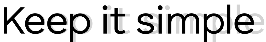
Letter spacing
Use a letter spacing of -2 when setting the tagline. This creates visual balance and keeps the look consistent across all applications.
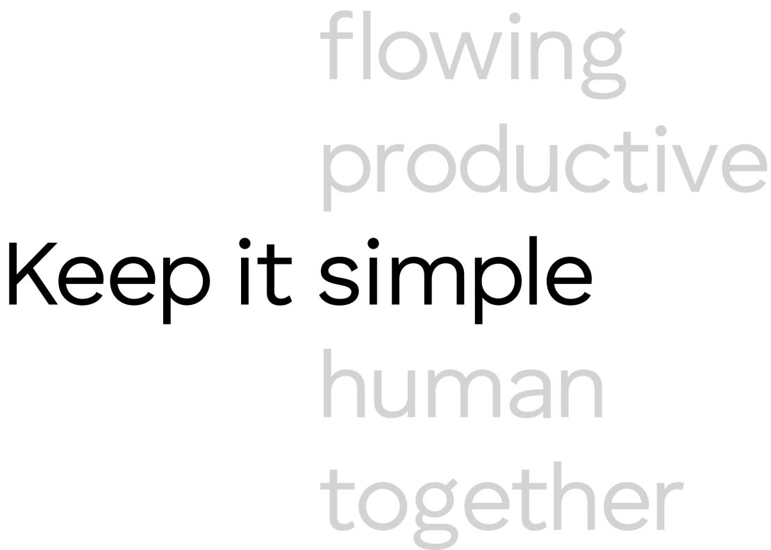
Tagline platform
Our core tagline “Keep it simple” can serve as a flexible slogan platform: Keep it. The third word changes based on context and no matter the variation, the format always follows the same typographic rules.
Alignment methods
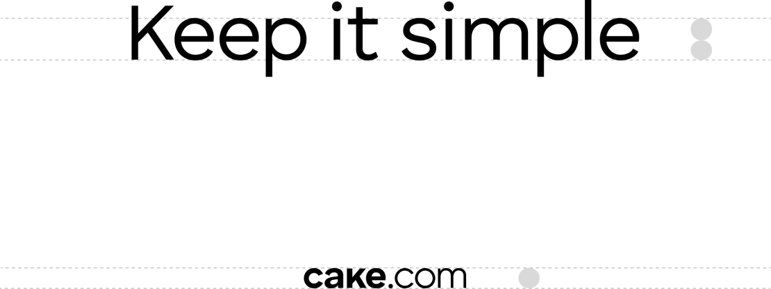
When the tagline appears next to the logo, align it horizontally to the x-height of the lowercase letters.
This keeps the pairing visually balanced and reinforces their connection as one unit within the layout. The same alignment should be used whether the logo or tagline takes visual priority.

Keep it bigger
When the tagline is larger than the logotype, the lowercase letters in the tagline should be set to be twice the x-height of the logotype.
Tagline in use
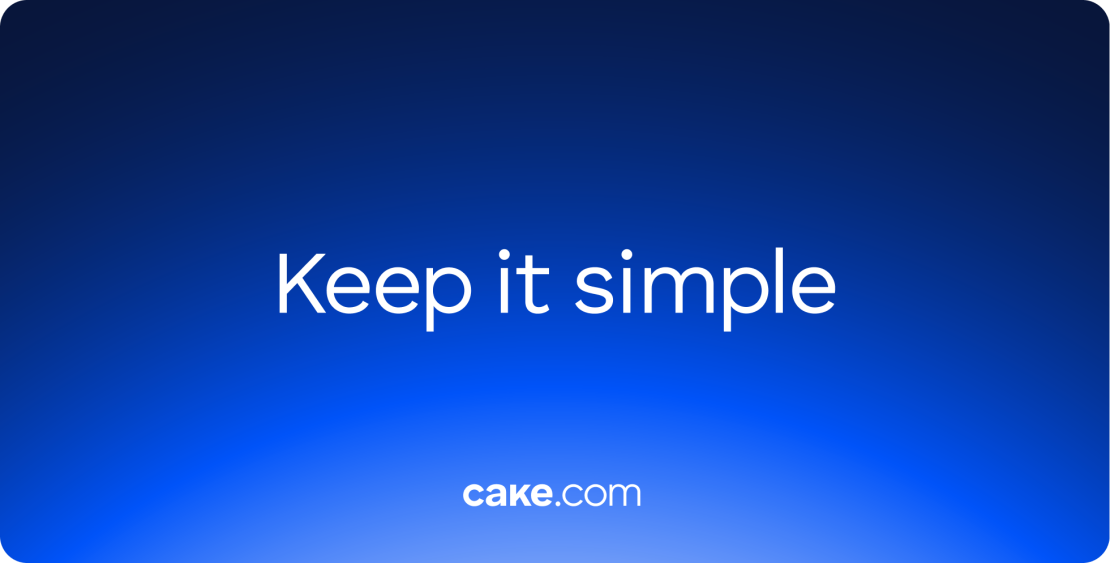
Big tagline
When used without any additional copy, the tagline may be scaled up as a central visual element. To ensure readability of the tagline across different backgrounds, a dark layer with the layer blur effect is added.
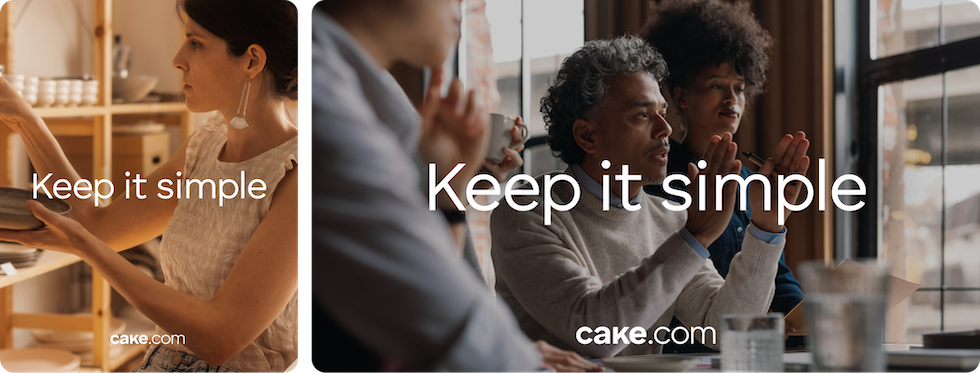
Standard tagline
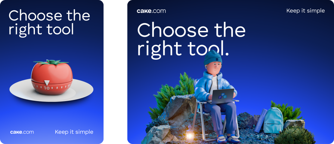
In layouts with other elements, like images, text, or UI components, scale the tagline to match the x-height of the CAKE.com logotype. This helps the tagline fit naturally into the design and keeps the overall look clean and consistent.