Shapes
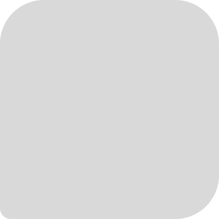
Our visual system is built around the rounded rectangle. This is the core shape consistently used as a foundation in our layouts, within interface structures, and in the box elements of our product logos.
Shape fundamental
The rectangle shape as a shared foundation, reflects our modular approach to design. It extends into all brand shapes, creating visual consistency while adding flexibility across formats.
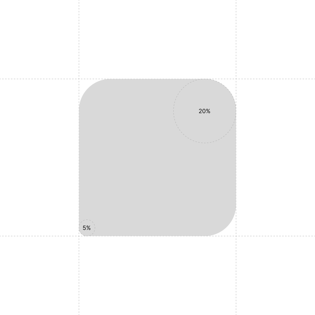
Differentiator for the base shape, product shapes and logo boxes is corner radius.

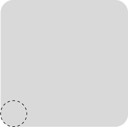
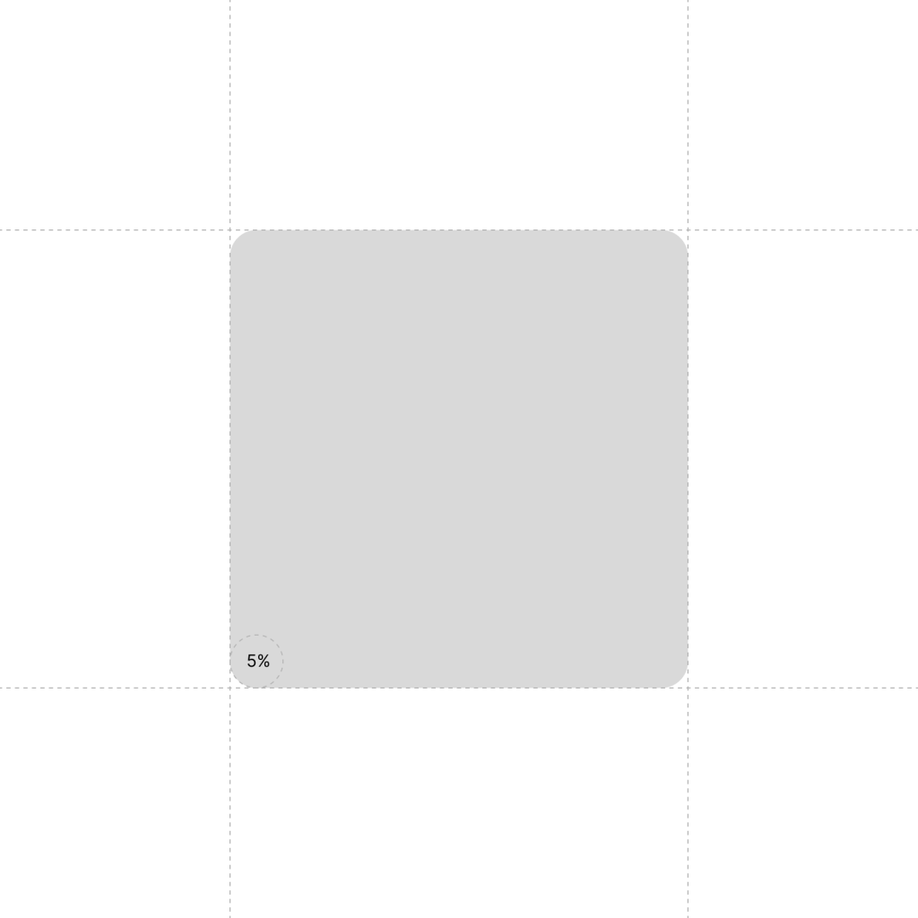
Base shape
5% corner radius
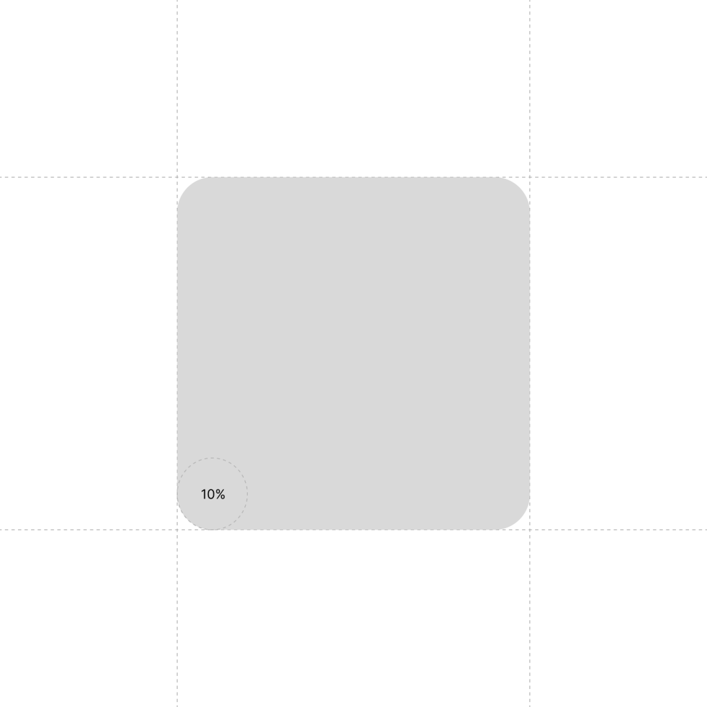
Product shape
10% corner radius
Logo box shape
20% corner radius
Product shapes
Each product shape starts from the rectangle as a foundation. From there, each evolves to reflect the product’s core purpose.
Clockify product shape
Pumble product shape

Plaky product shape
cake.com
For the brand shape, a 5% corner radius form brings softness and consistency to the visual language. It’s the building block for everything: logos, icons, buttons, and illustrations. This shared structure ensures every element feels cohesive, approachable, and unmistakably CAKE.com.
Clockify
Clockify’s shape echoes the ticking of a watch, representing a visual block of time. It is derived from the core square, with 5% corner rounding.

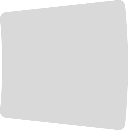
Pumble
Pumble’s shape is based on the core square reinterpreted as a speech bubble – capturing Pumble’s role as a team communication tool.
With 20% corner rounding on three sides and one sharper 5% corner, it subtly mimics a chat tail.
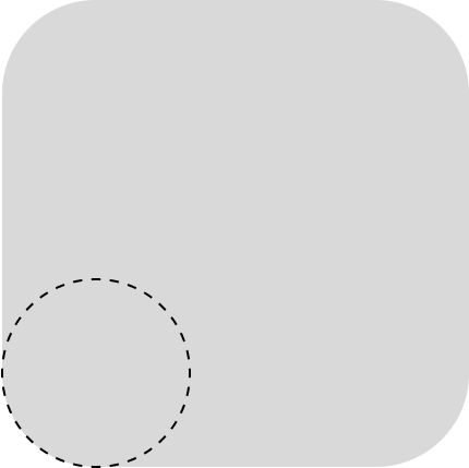
Plaky
Plaky’s shape is inspired by a table cell, its most recognizable symbol. Built on the base square with uniform 10% corner rounding, it reflects Plaky’s clean, adaptable nature.