Color best practices
Algorithm
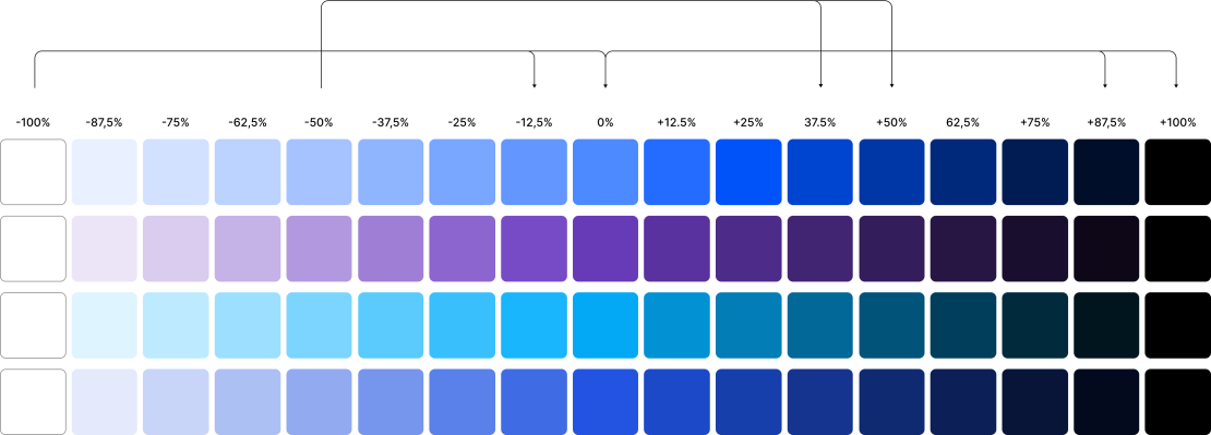
Contrast difference should be either +100% or ±87.5%. To maintain clarity and visual harmony across the system, every shade must follow a consistent algorithmic step, either increasing or decreasing brightness by 87.5%, or jumping to full contrast at 100%.
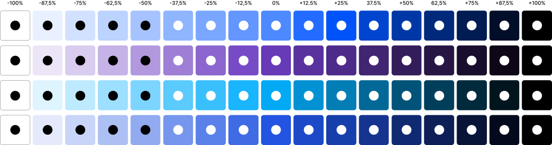
To ensure readability and visual clarity, text and shape colors must always contrast strongly with the background.
Use white text and shapes on dark or saturated backgrounds, and black text and shapes on light or desaturated backgrounds.
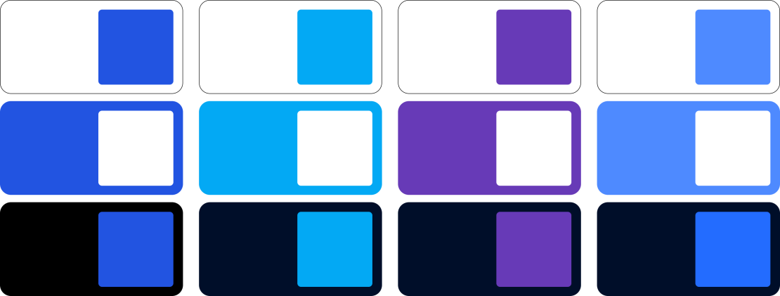
Main combinations
Main combinations rely on strong contrast, moving from 100% to 0% to 100%. This means pairing each primary brand color with black or white to achieve maximum clarity and impact.
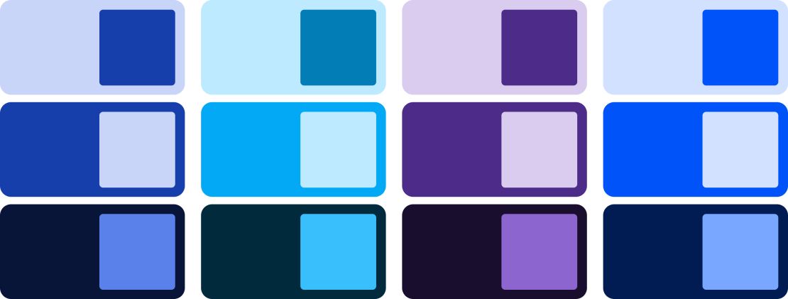
Secondary combinations
Secondary combinations use mid-range contrast, ranging from -50% to +50%. These tones are determined from the primary brand color and provide a softer, more subtle pairing.