Text styles
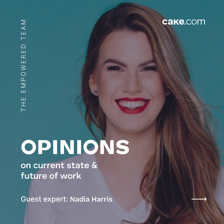
Text styles can vary depending on the visual format. If possible, use text styles defined by our guidelines — if not, make sure that the text is visible throughout the whole visual.


Type exceptions
The light style for secondary text can be horizontally or vertically aligned. Use it for naming different types of content: quotes, campaigns, themes, dates, etc.


Graphic elements
Apart from typography, we use a variety of other graphic elements: blurred blobs, photos, 3D illustrations, and grids.
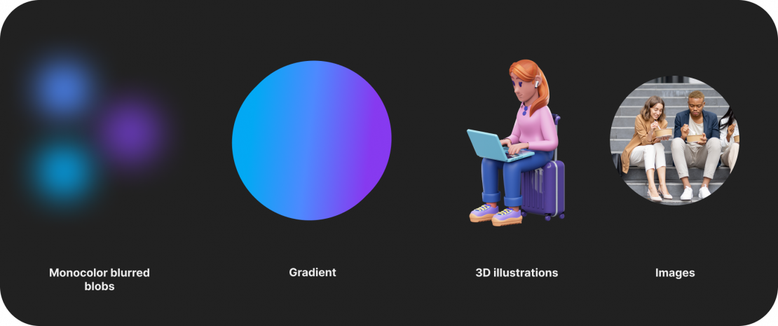
Examples of graphic elements applied in design


Logo size
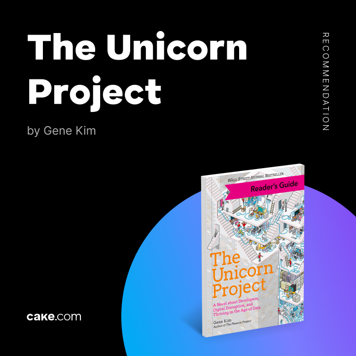
For an Instagram post: 328 x 40 px
For an Instagram story: 328 x 40 px or 410 x 50 px (preferred)
For a Linkedin post: 246 x 30 px
For a Twitter post: 328 x 40 px or 410 x 50 px
If the logo is not used for a social media cover or profile image, do not use a size bigger than 492 x 60 px.
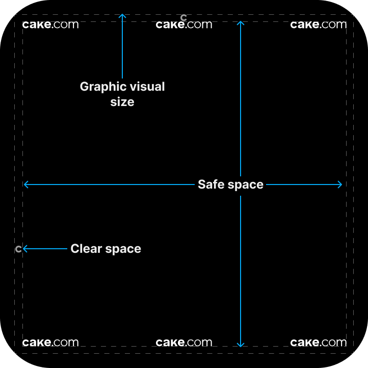
Logo placement
The logo should be placed in one of the corners, or centrally aligned on the horizontal axis — like in the picture below. This is no exception for the clear space rules.
Text color
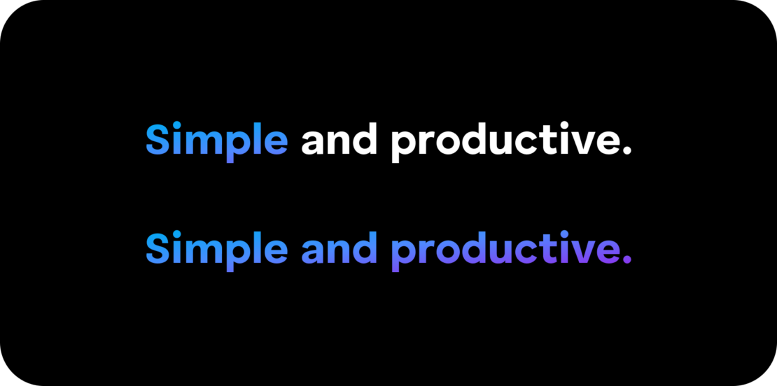
Heading
The linear gradient may be used only on headings or for a word that you want to accentuate. Otherwise, the headings should only be in black or white.
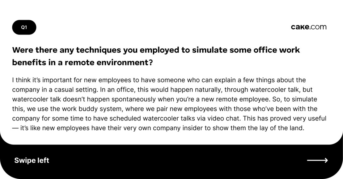
Body
Body text should be in black, white, or shades of gray.
