- Do
- Don’t
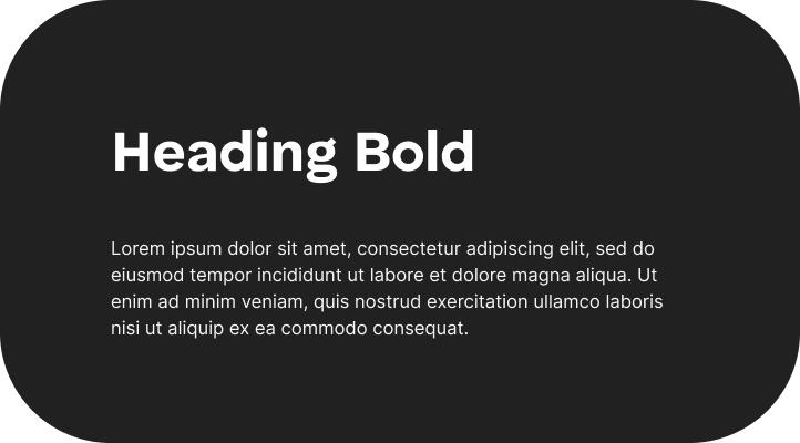
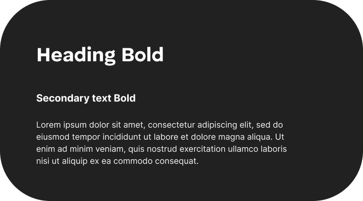
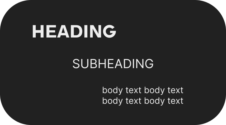
Do use the correct hierarchy

Do rotate secondary text for 90, when rotating it

Do use tracking for secondary texts
Do use the correct alignment
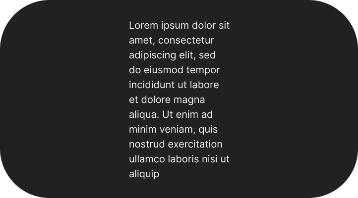
Do use the adequate line length

Don’t warp the text diagonally

Don’t use other fonts
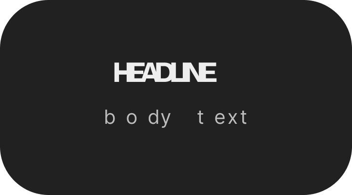
Don’t adjust tracking in a way that can make the text unreadable

Don’t use the same font size for different types of text in the hierarchy
Don’t adjust leading in a way that can make text unreadable
Don’t use too many different alignments